A strong typographic
identity for the
Berlin State Opera
A strong typographic
identity for the Berlin State Opera
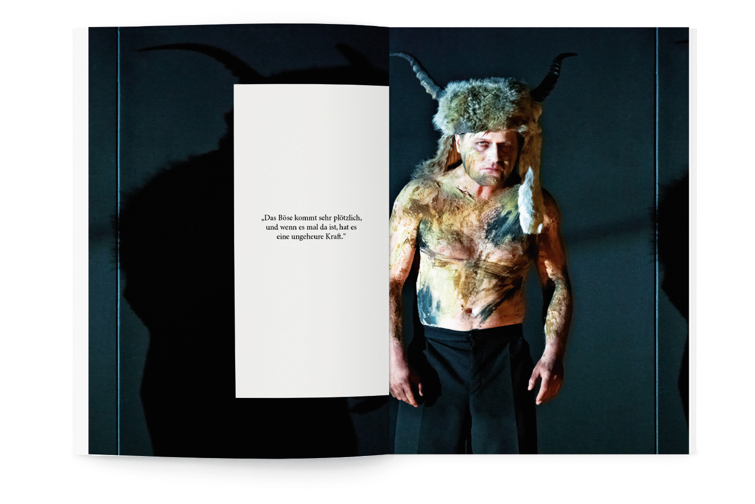
The Berlin State Opera (Staatsoper Unter den Linden) is a well-known German opera company. Its home is on the Unter den Linden boulevard in Berlin. Until 2017, the building was under construction. On the occasion of its reopening, the opera asked for a new corporate design and a campaign to advertise the return.
This design proposal was not selected. It's still one of my favorite projects.
Client: Staatsoper unter den Linden
Discipline: Brand identity and campaign (Pitch)
Year: 2016
With: Boros


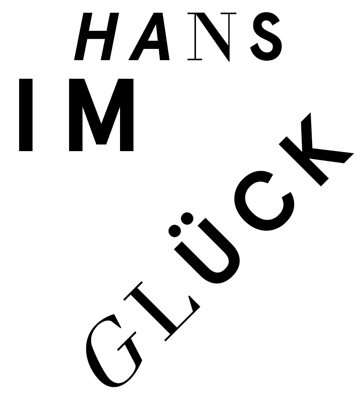
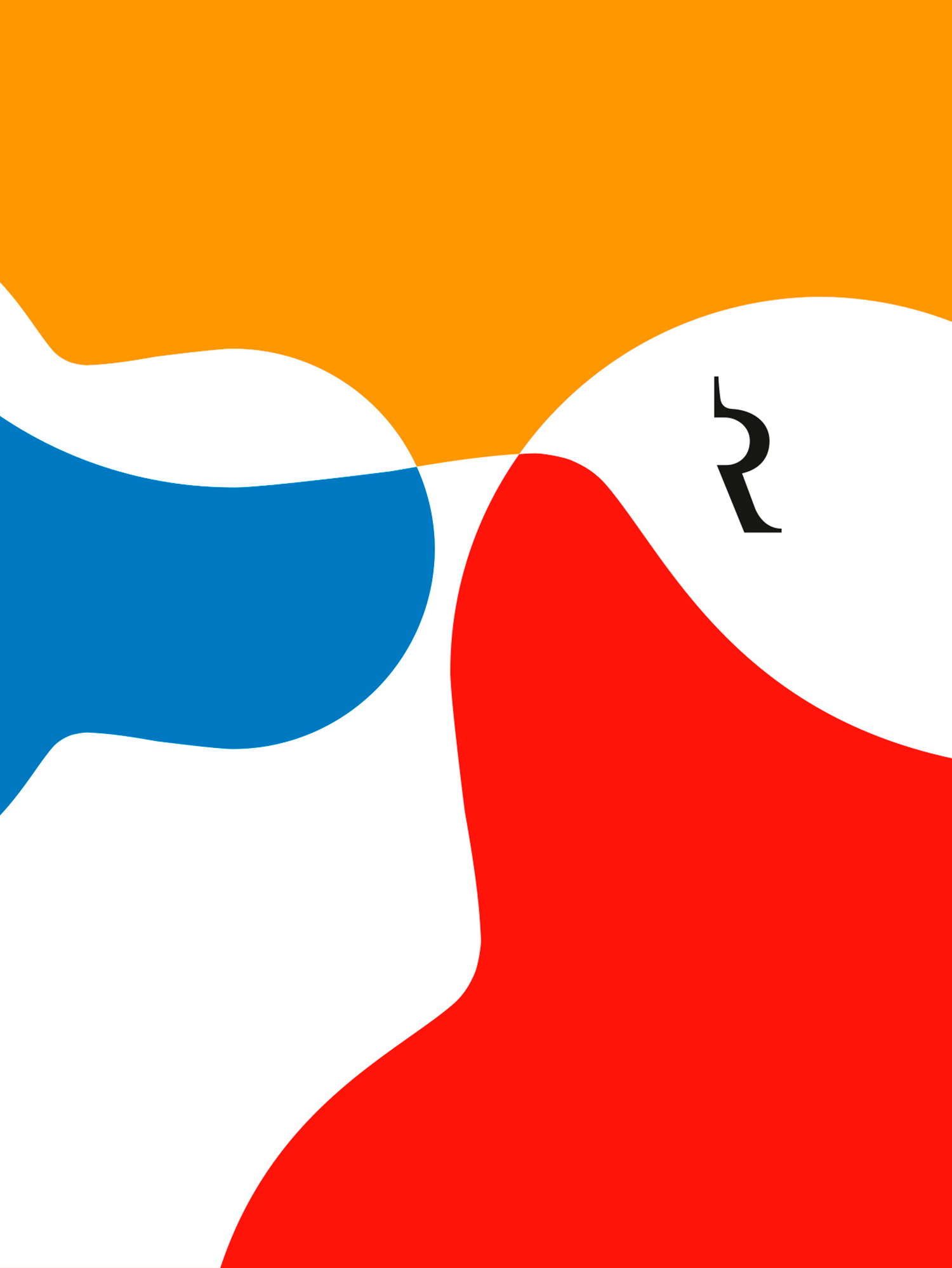
The design concept is based on the idea of polarity: The opera as a cultural heritage between restoration and modernization, tradition and innovation, exclusiveness and openness.
The design concept is based on the idea of polarity: The opera as a cultural heritage between restoration and modernization, tradition and innovation, exclusiveness and openness.
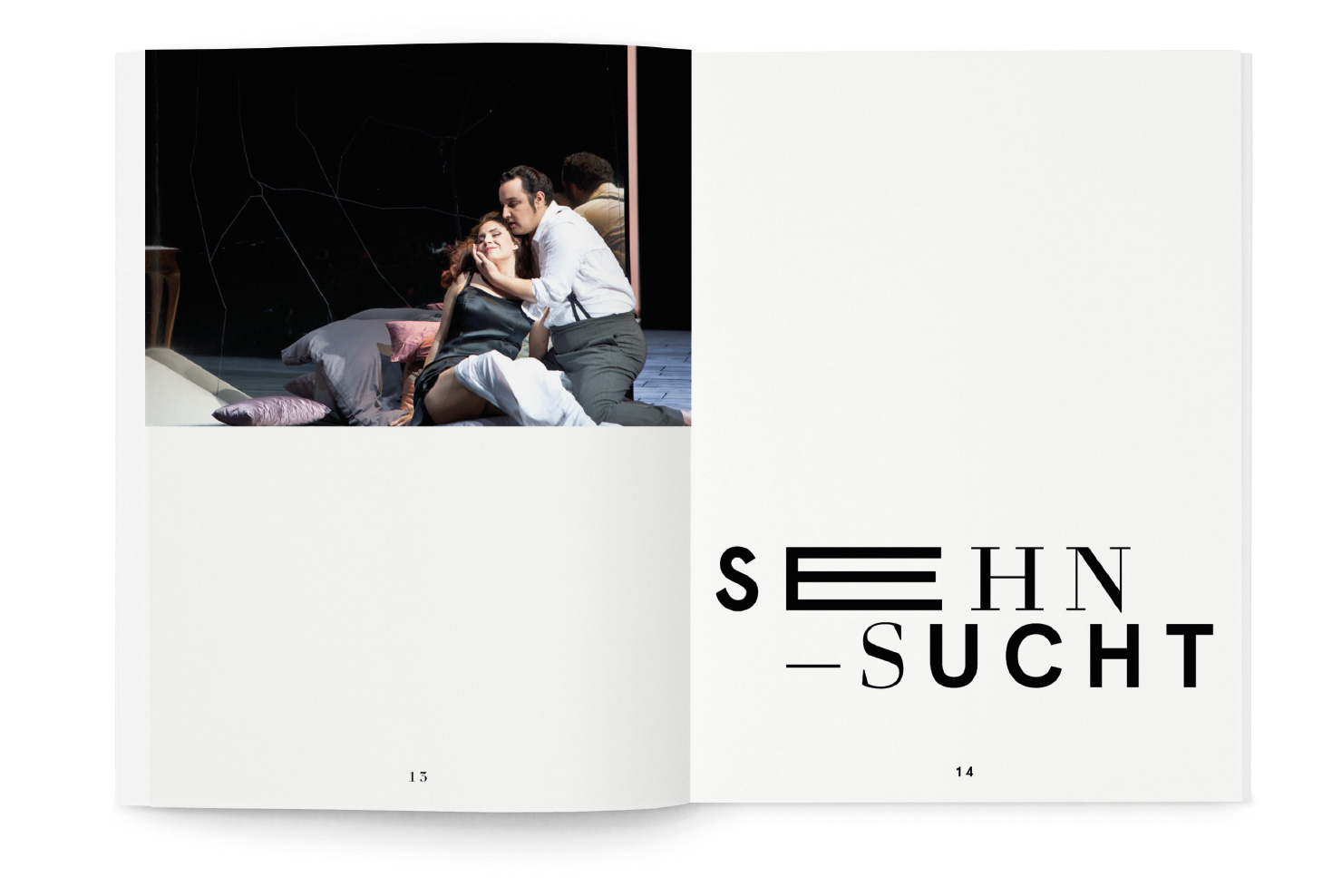
Based on this idea, the combination of typography is the primary visual component of the new design. The neo-classical font Prillwitz and the sans-serif font Aperçu build a look with a high recognition value and translate the spirit of the opera: A dialogue between tradition and innovation.
Based on this idea, the combination of typography is the primary visual component of the new design. The neo-classical font Prillwitz and the sans-serif font Aperçu build a look with a high recognition value and translate the spirit of the opera: A dialogue between tradition and innovation.


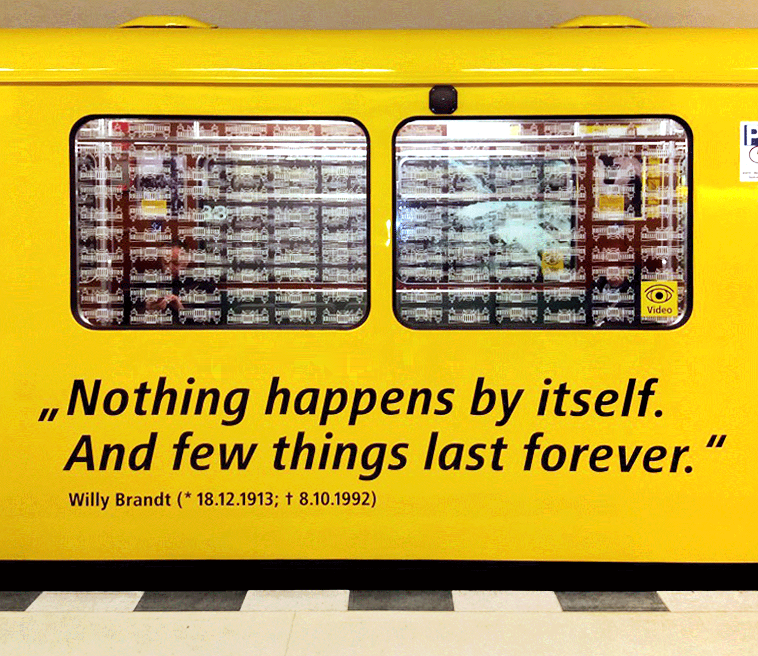
"She was homesick."
The homecoming campaign personifies the opera and introduces the typographic identity.
"She was homesick." The homecoming campaign personifies the opera and introduces the typographic identity.


More Projects

Radio Fritz in behalf of rbbConcept, corporate identity and multichannel campaign for Radio Fritz on behalf of rbb ⟶

radioeins for rbbCorporate identity and various campaigns for radioeins on behalf of rbb ⟶

Genuair® for Berlin-Chemie AGMultichannel campaign for the Genuair® inhaler ⟶
KaDeWe Christmas window displaysDesigning the Christmas window displays for KaDeWe, Alsterhaus and Oberpollinger ⟶

sun.set music festival at Fondation BeyelerEvent branding for the music festival sun.set at Fondation Beyeler ⟶
"Der Demokratiewagen" on behalf of BVGA rolling exhibition concept and design for BVG ⟶

Kazimir Malevitch at Fondation BeyelerBranding for the exhibition "In search of 0,10" at Fondation Beyeler ⟶
Logo design for AMGENLogo design for a healthcare conference on behalf of AMGEN ⟶
Book cover for Rellin VerlagCover design for the book "Klar bin ich eine Ostfrau!" on behalf of Rellin Verlag ⟶
Logo design for DPDHL Deutsche PostLogo design for the DPDHL ⟶
The future could be ours.
Get in touch!
The future could be ours.
Get in touch!
2020 © Christine Putz